Here lies Google Plus: Why it never scored (a lasting audience)
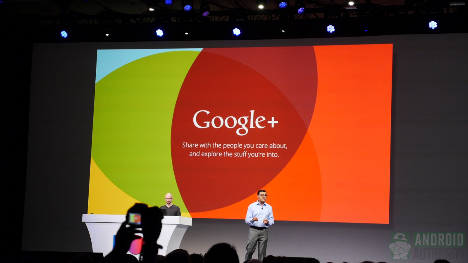
Google Plus (Google+) was one of Google’s most ambitious social network projects. It’s also one of Google’s most epic failures. It had over 500 million active users at one point. Some of Google’s best apps were spin-offs of their Google Plus counterparts, like Google Photos, Google Hangouts, and the roots of YouTube’s live streaming came from Hangouts-On-Air. With such a vast collection of features, active users, and integrations with other Google services, how the hell did Google Plus manage to fail?
It wasn’t any one problem. Google Plus died after years of bad decisions, unfortunate luck, and unforeseen circumstances. Let’s take a look at a brief history of the bad decisions that led to the demise of Google Plus, or at least contributed strongly to it.
The good years: 2011-2014
The first few years of Google Plus were actually quite good. It had a range of features other social networks didn’t have and a lot of people really enjoyed it. The friend circle feature allowed people to micromanage their friend lists. It had a functional hashtag system like Twitter, but posts could be longer like Facebook. Posts also had light formatting options.
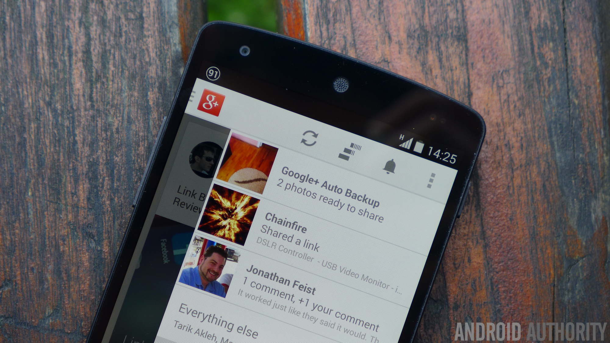
Google Plus’ playfulness is what really made it unique, though. Uploaded photos sometimes received fun effects from Google Plus Photos and Mr. Jingles was always themed for various holidays. Hangouts-On-Air was particularly popular around this time as well with various news outlets (including us) using them for regular content.
People with non-related interests never looked at Google Plus the same way as its loyal user base.
These years were all about connecting people with people. Google Plus was a great place to talk to people interested in the same stuff you were, and most of its features were set up for that purpose. Hangouts-On-Air, events, and communities were all features to connect people to one another. It was a neat idea and it worked well, but it prevented a lot of the usual stuff social networking is good for, like following your favorite musicians or sporting organizations. Blogs, celebrities, and large companies had little to no reason to join and received little love if they did.
This kind of dovetails into the worst problem of the early years. Google Plus was an amazing place for photographers, tech nerds, Android nerds, and, believe it or not, SEO specialists — that’s basically it.
In 2012, most of the top trending hashtags on Google Plus were tech related, like SOPA or Google I/O 2012. Every other social network was in the grasp of #YOLO, the London Olympics, the 2012 U.S. Presidential election, and Gangnam Style.
Google Plus’ biggest problem in its early years was its mainstream appeal — it had none. It tried different things to broaden the service’s horizons, but none worked. Google Plus was a home for tech nerds, SEO specialists, and photographers,. People with unrelated interests never really looked at it the same way. Oh, and who could forget this gem when Chinese internet users spammed Barack Obama’s Google Plus page?
The first four years saw vast success. The YouTube integration made it easy to talk to other YouTube commenters and share videos to people. The service reached its zenith with over 500 million active monthly users. Hell, even I had almost 50,000 followers there and I’m not that interesting. Everybody loved Mr. Jingles, Auto-Awesome was turning our photos into fun stuff, and Google Plus Photos was practical and fun. It was a good time.
YouTube creators hated Google Plus integration, but they hate everything YouTube does. The integration was useful for regular people.
However, this era ended on a down note with the departure of Vic Gundotra. Vic was one of the founders of Google Plus and by far its most prominent supporter. He was enthusiastic, forward thinking, and truly wanted Google Plus to succeed. As far as we know, the departure was amicable on both sides. It’s not exactly a mistake, but it changed the leadership and the direction of Google Plus. We consider this the end of the early years, where the only notable problem was mass commercial appeal.
The middle years: 2014-2016
The middle years brought stark changes and weird decisions for Google Plus. The network had new leadership and a new direction. That direction would be to basically rip all of the best parts of Google Plus out of the network and into separate services. This direction was largely negative and caused a ton of problems within Google Plus. By the end of the middle years, it was readily apparent to most people the network was circling the drain.
For effect, let’s just list all of the stuff that happened during this era so you can see just how much the service was gutted.
2014:
- Various reports indicated Google was putting Google Plus on the back burner. This means less resources, less opportunities for growth, and fewer employees. The Google Plus team moved to a different part of Google’s campus with fewer employees. Many believe this is the real reason for Vic Gundotra’s departure.
- This was around the time when bloggers started criticizing Google Plus for its active user count. The active user count seemed to fluctuate wildly, with each drop prompting a wave of articles proclaiming Google Plus deceased. We don’t believe it affected the user count much, but the media proclaiming the service dead two or three times a year certainly didn’t help.
2015:
- Sundar Pichai said in early 2015 that Google Plus Hangouts, Google Plus Photos, and Google Plus itself would be thought of as different products, with Google Plus still very much in the mix. He didn’t clarify further.
- Google began removing hashtags from posts in Google Plus, which made it harder to follow trending topics and current events.
- The friend circle sharing feature was quietly removed around this same time. This made it harder to find new people to follow, since Google Plus’ recommendation engine was full of inactive profiles.
- In May of 2015, Google added Collections to Google Plus. This signaled a massive shift from its people-first style to a things-first style. Individuals maintained collections instead of Google. However, people could follow collections as though they were people. It was a weird thing.
- Google Photos is ripped out and made its own thing. No more Auto-Awesome or neat little photo tricks on Google Plus!
- YouTube integration was removed from Google Plus later that same week. By 2017, even YouTube comment notifications were phased out entirely.
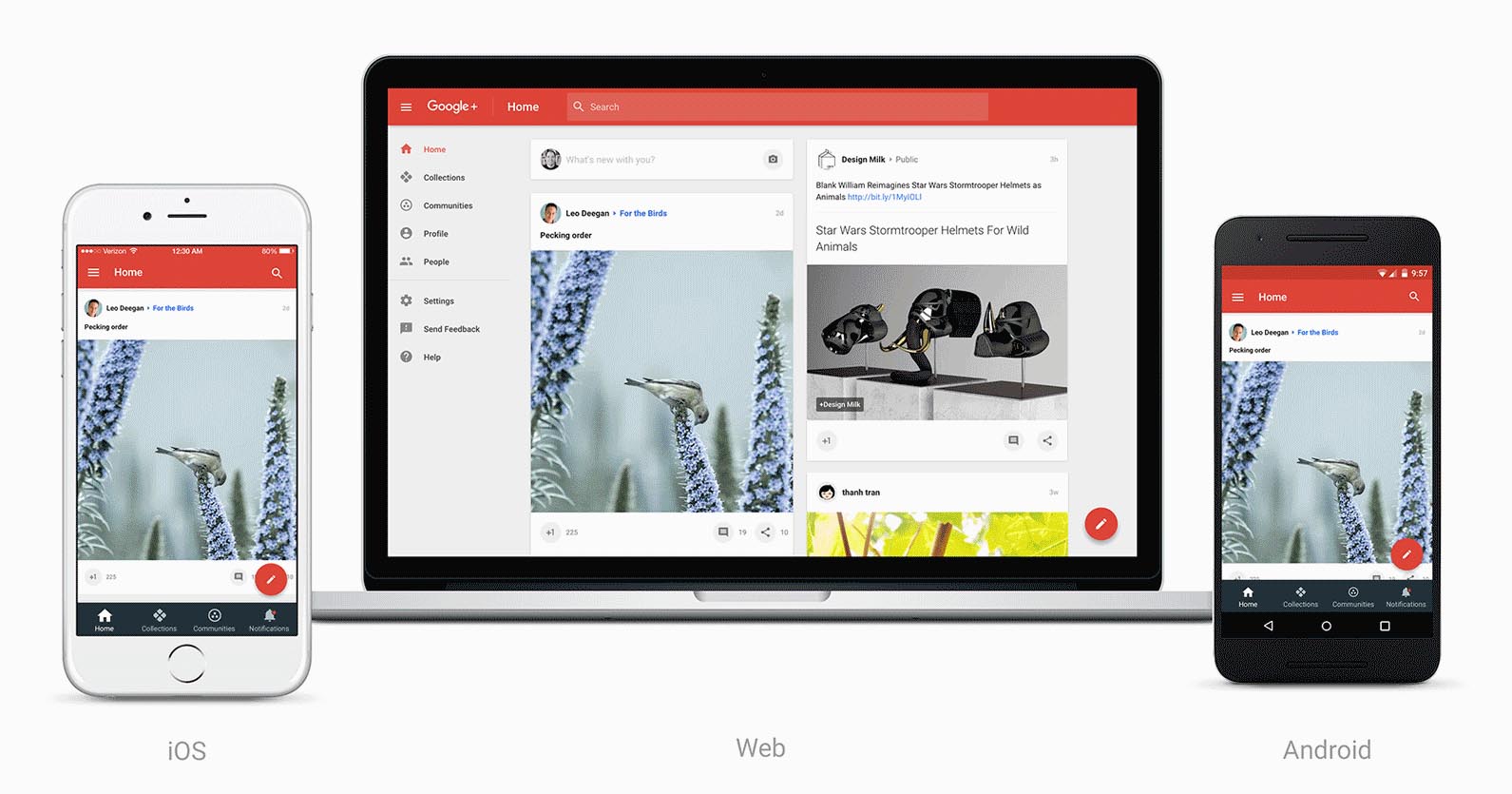
- A huge redesign put Collections and Communities in the spotlight while continuing to minimize the actual main feed of Google Plus.
2016
- Google Plus fully shifted from a chronological timeline to an algorithm timeline like Facebook.
- Google Play Games was ripped out of Google Plus and made its own thing.
- Event Pages were phased out and removed with little fanfare.
- Hangouts-On-Air was phased out as well. It eventually became a part of YouTube Live.
Social networks usually gain features as they lose them. Google bucked this trend by removing tons of features and adding little more than Collections.
Sometimes it made sense to spin features off. Google Photos is the best photo storage service on the planet and Hangouts remains Google’s best effort in the messaging space. That doesn’t explain why they couldn’t still be a part of Google Plus, unless the ultimate goal was to eventually shutter the service anyway.
The additions that actually happened changed the fundamental feel and style of Google Plus. Collections shifted focus from socializing with real people to following things. The feature was a disaster from the outset. Every Android tech nerd had an Android collection. You can still find hundreds of wallpaper collections on Google Plus. The change from a chronological timeline to an algorithm one (and the removal of hashtags) made discussion about relevant and current events basically impossible. Google Plus’ timeline algorithm heavily favored Collection posts over normal content, too. Collections were neat in theory, but horrible in practice.
By the end of 2016, Google Plus was a shell of its former self with no new features to fill the void.
By the end of 2016, Google Plus had lost Auto-Awesome, Google Plus Photos, Google Plus Hangouts (mostly), Hangouts-On-Air, Events, Hashtags, its chronological timeline, its focus on personal interaction, YouTube integration, and a very good portion of its staff, resources, and active user base. Posts also had fewer formatting options and no more massive blob emoji options (I personally loved those, it helped style up posts without images). Finding new friends to talk to became much more difficult than it used to be. If you surf through some of the most popular profiles, many of them have their final posts in 2015 and 2016.
The “ghost town filled with sex bots” years: 2016-Present
User engagement continued to be a problem in the waning years of Google Plus. It was like the last day of a festival. Some people were still around, but active users were few and far between and trash was everywhere. It definitely felt like a network in its final years. Personally, most of my post comments in these days were people expressing they thought I left years ago, because the algorithm is finally showing my posts again after years of hiding them from my followers.
That doesn’t mean Google didn’t try to kill it even faster, though. Mr. Jingles met his end sometime in the middle of 2017 and what few Google Plus services remained were re-branded. The service saw a bit of life in 2017 with a new redesign, which favored posts with images so Google could minimize white space on the site. Of course, if you didn’t use images, you were pushed out of the timeline once again. Community leaders and some prominent active users talked and debated on the site about ways to save Google Plus and identify its biggest problems and weaknesses. There were some promising ideas and discussions that ultimately never led to anything constructive or actionable.
They tried, though.
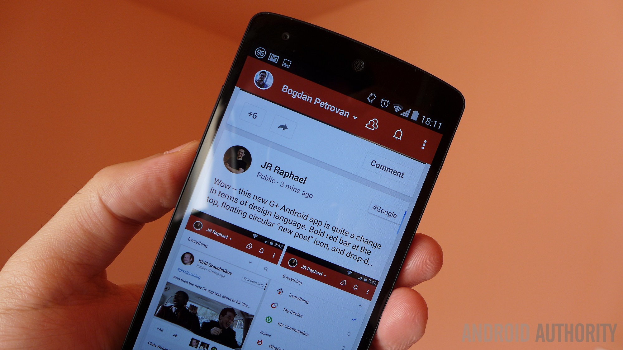
A fully re-designed Android app launched in early 2018 to little success or fanfare. It had a new look and feel, but didn’t bring any new features, new functionality, or a new direction for the site. Bots became a big problem during this time as well. It was more than just your usual spam bots promoting work-from-home opportunities or whatever. These were full-blown sex bots with links to webcam shows and other porn spam stuff. Google introduced a Delete, Block, and Report feature, which helped with the spam. The bot problem fell off and returned multiple times from 2017 to 2018. It annoyed community managers more than the few remaining active Google Plus users, though.
Porn spam bots and old, abandoned Collections were Google Plus’ final big problems.
Perhaps the biggest problem during the last few years were the relics of the past. Most people left Google Plus before 2016, but their various contributions did not. If you search for wallpapers on Google Plus for an active wallpaper Collection, good luck. There were hundreds of them and they are all basically abandoned now.
Those who still wanted to use Google Plus had to wade through digital rivers of floating garbage to find still-active portions of the site. It was bad enough so few people existed on the network without them having to dig through the ashes of a once bustling website to find each other. Using the site today brings an undeniable sense of melancholy as you gaze upon all of the untapped potential and abandoned projects that people once cared about.
In 2018, Google fixed a bug in the Google Plus API exposing user data and ultimately decided to close down Google Plus for good. It’ll see its last day in August of 2019.
Goodbye Google Plus!
There isn’t much else to say, really. Google simply didn’t treat Google Plus like its other products. At one point it was two or three product integrations away from being a social media hub for all of Google’s products. Instead, it was gutted in its prime, mismanaged for years, and left to die while the products it created live on. The lively, quirky experience of early Google Plus contrasted nicely with the usually cold and detached experience from most social media sites. It also positively influenced the industry as Mark Zuckerberg put Facebook on lock down once to bring Facebook on par with Google Plus. Even without it here anymore, we can see its lasting influence.
It never received the same love and care Gmail, YouTube, or Calendar received. A relatively small number of people will really miss Google Plus, including me. Thankfully, the service will live on in the form of Google Photos, YouTube Live, and (hopefully) Google Hangouts.
Goodbye, Google Plus. I had fun.
Source: Android Zone
The post Here lies Google Plus: Why it never scored (a lasting audience) appeared first on TuneMaster.ml.


